
Powered by Deutsche Telekom, AG
Qrew Employee App
[bachelor thesis
CASE STUDY
Product/UX design]
Role
Product/UX Designer
Timeline
Sep 2024 - July 2025
Team
1 PM
2 Engineers
1 Designer (me)
Skills
User Research
Competitive Analysis
Prototyping
[OVERVIEW]
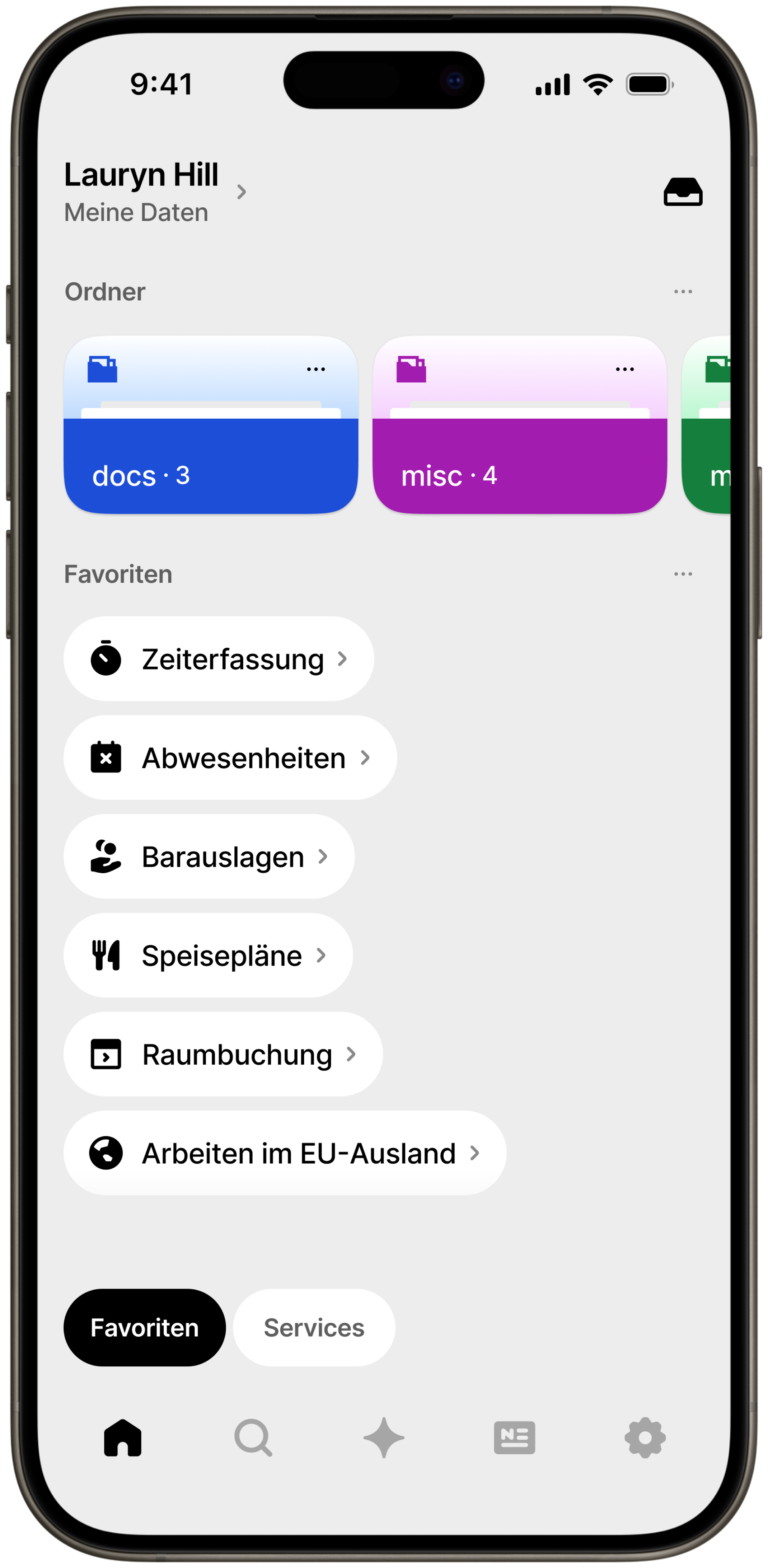
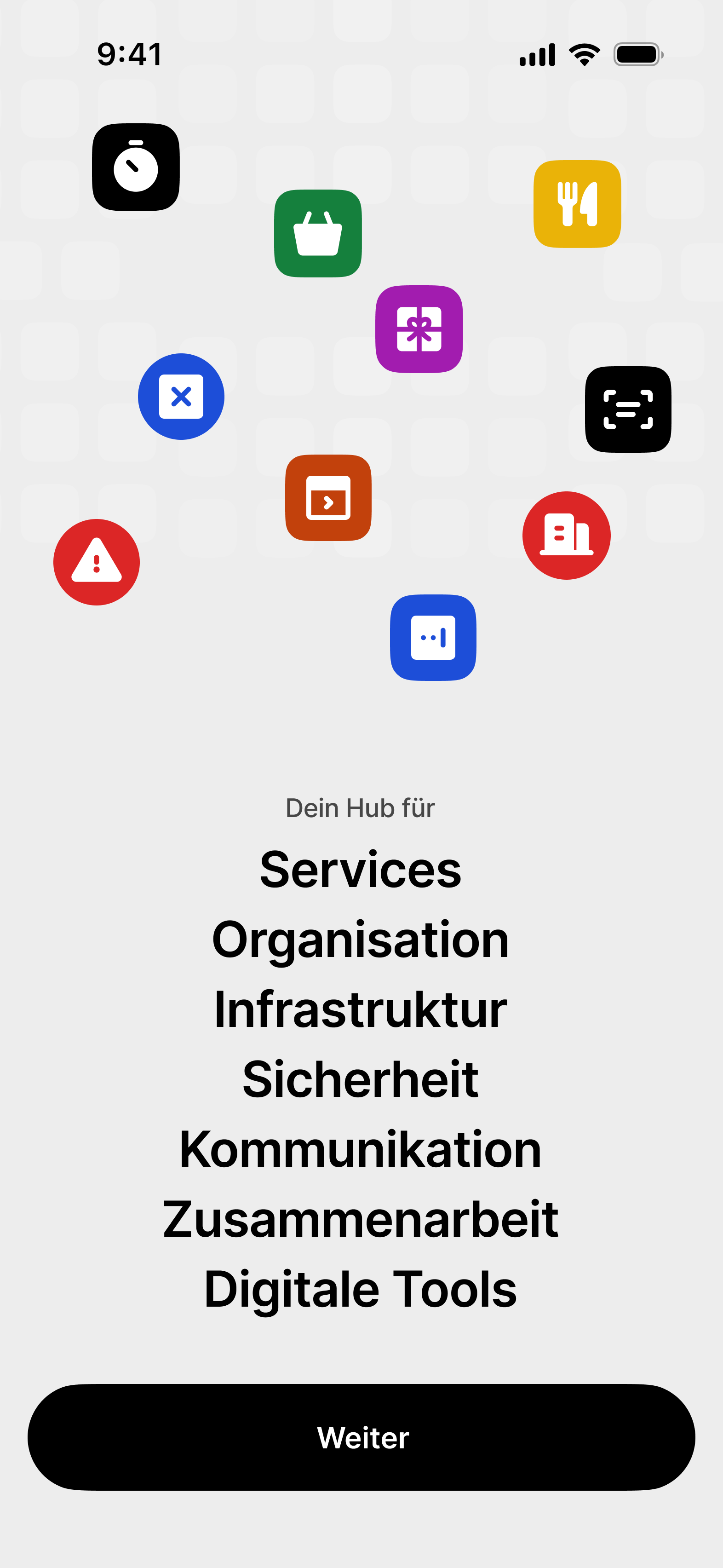
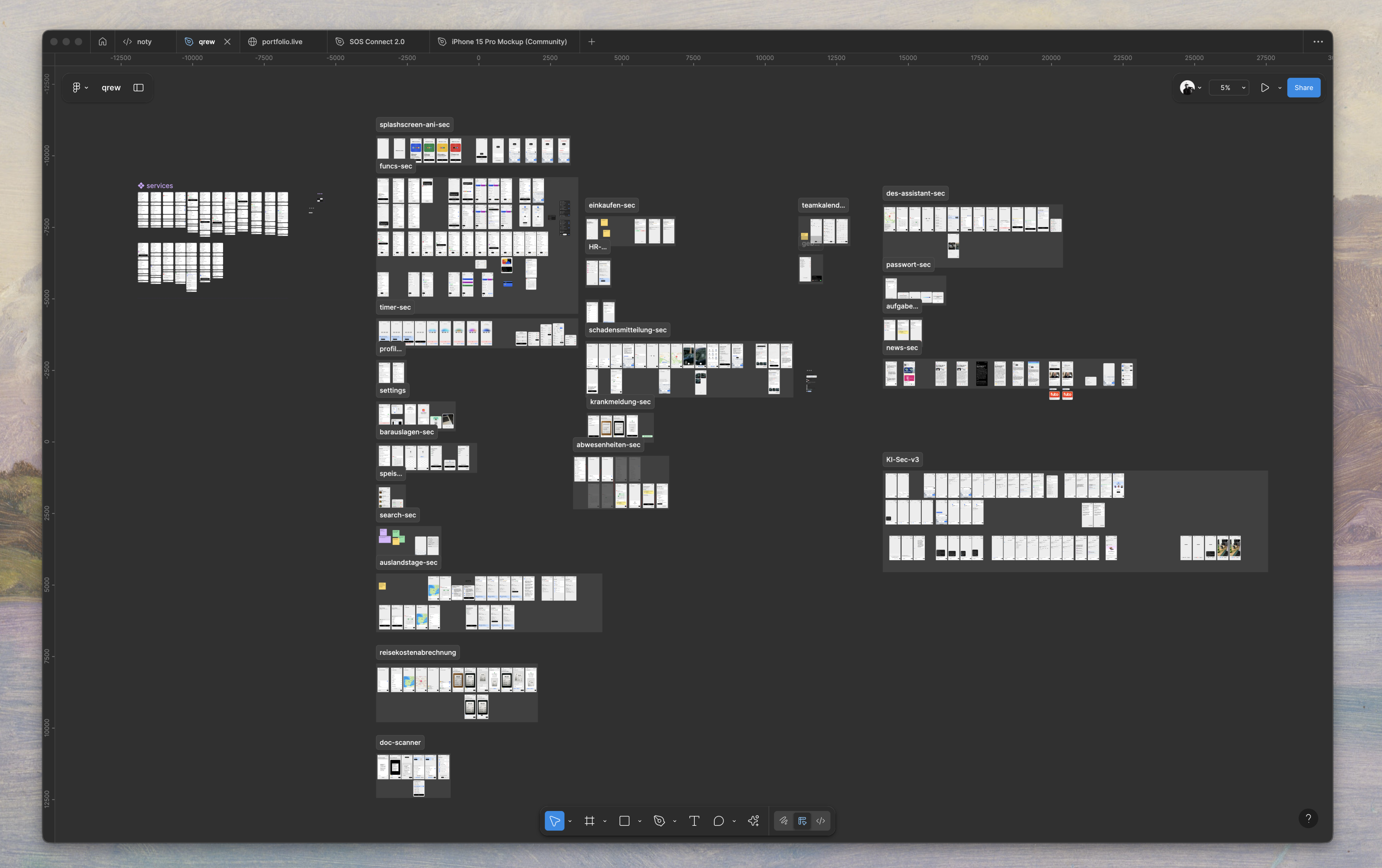
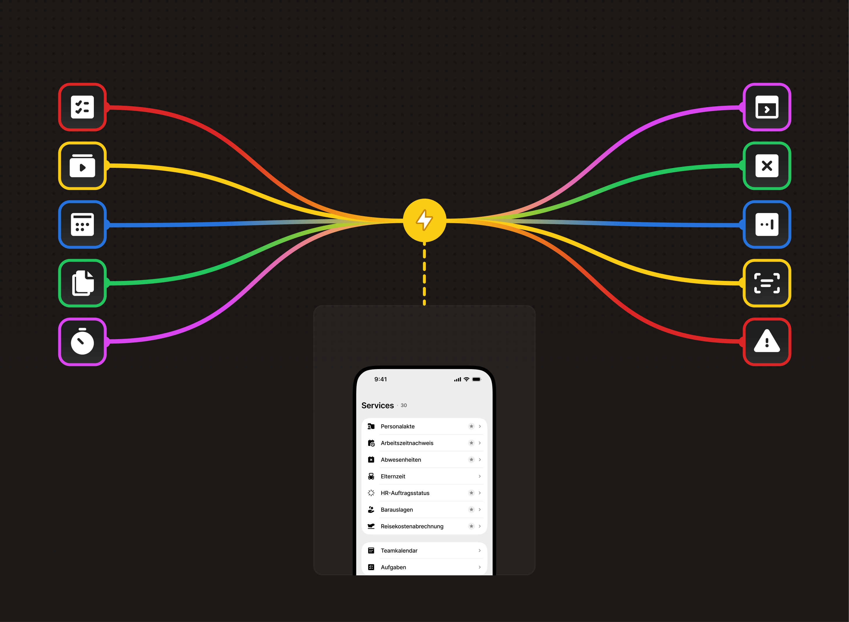
Qrew consolidates 31 essential workplace functions into a
single mobile-first platform designed to execute core administrative tasks in under 60 seconds without distractions.
Enterprise employee app targeting time tracking, room booking, HR processes, and facility management for large corporations requiring streamlined, distraction-free workflow efficiency.
Key Metrics
Primary user
problem solved
Eliminated the dual frustration of (a) manual analog submission processes for all workplace tasks and (b) fragmented tool landscape across multiple interfaces and systems, creating a unified digital workspace that consolidates 31 essential HR functions into one contextually-adaptive mobile platform.
2-3
minutes saved per task-switching through function consolidation
<60
seconds completion for critical tasks (sick leave, time tracking)
40%
improvement in task completion ease through structured navigation
23%
reduction in user error clicks after UI optimization
35%
faster task completion for recurring activities
40%
fewer support requests related to navigation issues
Business Value Created
Operational Efficiency
Reduced manual tasks via automation, allowing HR to focus on strategy.
Cost Reduction
Achieved ROI with faster processing (2-3 mins saved), 40% fewer support requests, and easier training through a unified interface.
Cultural Transformation
Facilitated digital transformation, supporting hybrid work and
employee autonomy.
Design innovation introduced
Contextual Progressive Disclosure
A new approach to software complexity with adaptive interfaces that reveal features based on user context, task frequency, and expertise, making enterprise suites intuitive.
Bottom-Screen Action Architecture
Optimized mobile interactions by moving primary actions to the bottom of the screen, reducing cognitive load and enhancing one-handed usability.
Cross-Device State Continuity
Enabled seamless session preservation across devices, allowing users to start tasks on mobile and finish on desktop without data loss.
[DESK RESEARCH]
Initial Findings
The current overview of information in similar apps is lacking, leading to error-prone processes and a subpar user experience.
Additionally, the existence of siloed solutions further complicates the overall effectiveness of these systems.
High prevalence, low satisfaction
87% of companies use an HR portal,
but only 7% are satisfied.
Intensive use for standard processes
76% of employees use the employee portal at least twice a week, primarily for time tracking, vacation requests, and payroll.
Differentiation is mostly superficial
Across point solutions, touted “differentiators” tend to be commodity: offline modes, GPS logging, multi-platform support, one-click timers. Genuine technological separation is scarce; notable gap is the underuse of automation/AI for recurring patterns.
[Business Context]
Current State Metrics
- Low user retention (45% drop-off after onboarding)
- 15-minute average session time
- 3.2/5 internal hub store rating
Stakeholder Pain Points
- CEO: Growth plateaued at 50K users
- Engineering: Technical debt slowing releases
- Support: 60% tickets about navigation confusion
Market Positioning
- #5 player in $2.3B market
- Competitors have 3x feature parity
- Unique value prop unclear to users
[competitor analysis]
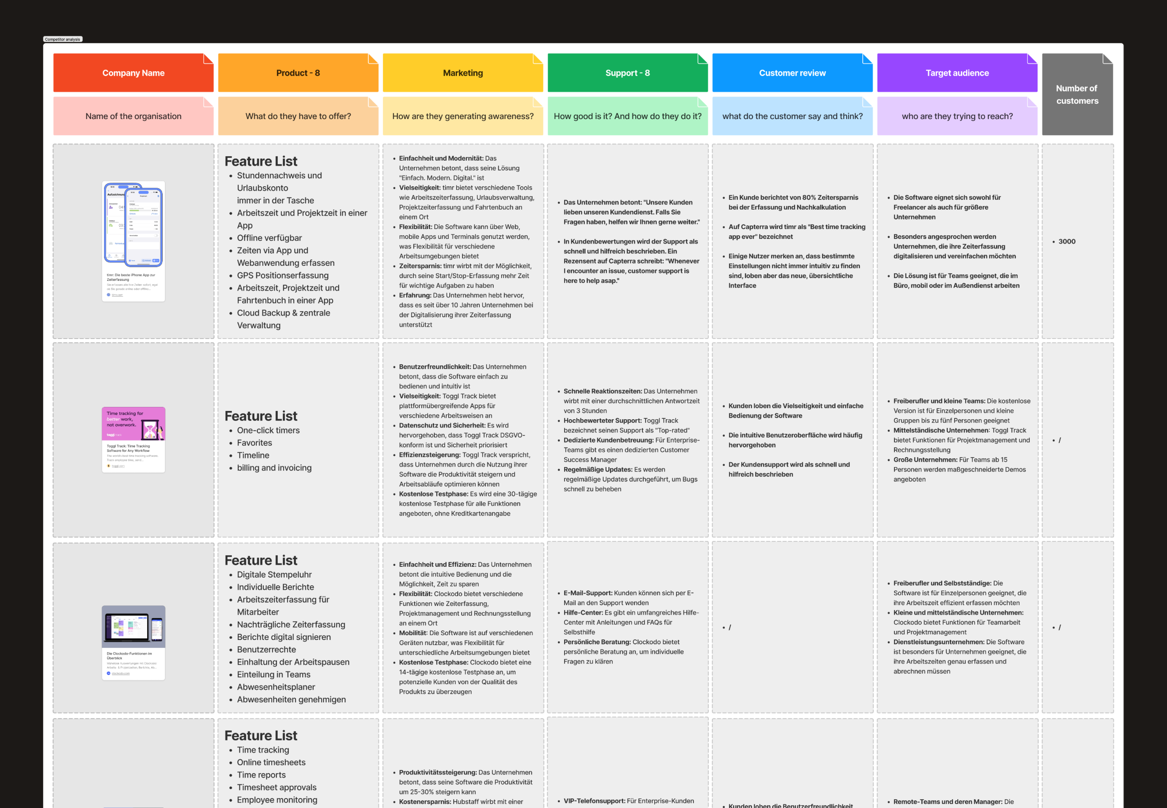
The market splits into three tiers
- Freelancer tools (e.g., Toggl Track)
- SME suites (Clockodo, Personio)
- Enterprise systems (SAP, ATOSS; plus Hubstaff with 112,000+ customers)
Support is a core differentiator
- Toggl Track advertises a 2-hour response time
- Clockodo adds live chat and VIP phone support
- Clockin monetizes support through ticketing
Feature sprawl is common
- Clockify lists 19 primary features
- Hubstaff markets 25–30% productivity gains and 25–35% cost savings via employee monitoring, which is flagged as problematic under European privacy standards
[BIGGEST CHALLENGE]
Integration at scale
without collapsing the UX.
Delivering a single, comprehensible interface on top of a deeply integrated, legacy-heavy enterprise stack, while meeting strict privacy/compliance and serving heterogeneous user groups. The conclusion explicitly downplays “optical brilliance” and elevates integration depth, employee rollout, and data protection as success determinants.
[SOLUTION]
The “solution” isn’t another flashy interface trick,
but a boring, heavy-duty mix of enterprise plumbing and governance. It’s:
Deep integration of existing systems
Rather than building stand-alone silos. The integration must be a primary design requirement, even if it multiplies project effort three to four times.
Privacy and compliance
Baked in as non-negotiable, meaning every integration has to expose controls and transparency rather than hiding them.
Cross-functional rollout management
Explicit training, onboarding, and staged adoption to prevent collapse under heterogenous users and departments.
Executive alignment and change management
Success is tied to leadership backing, structured introduction, and ecosystem building, not just product design polish.
[qualitative research]
Research
& Discovery
Goals
Identify cognitive costs in workplace systems. Understand generational differences in usage.
Validate hypotheses on transparency and abandonment. Discover when employees access functions.
Methodology
Semi-structured interviews of 45-60 minutes with task scenarios. Think-aloud protocol during system demos to capture frustrations.
Affinity mapping post-interview to cluster insights into design themes. Cross-generational sampling for representative coverage.
Sample size
15 Telekom employees: HR Operations Specialist, Facility Manager, Service Coordinator, Project Coordinator, and Team Lead.
Small, diverse sample for qualitative research, focusing on depth to understand mental models and workflows within enterprise constraints.
Sample represented core user segments for scalable insights.
[user pain points]

Sarah, 22
Daily User
Navigation Confusion
"I can never find what I'm looking for. Everything feels buried in submenus."

Marcus, 35
New User
Onboarding Overwhelm
"Too much information at once. I just wanted to get started quickly."

Jennifer ,42
Power User
Missing Core Features
"Why can't I export my data? Every other app has this basic functionality."

David, 31
Business User
Performance Issues
"The app freezes when I try to upload files. It's incredibly frustrating."
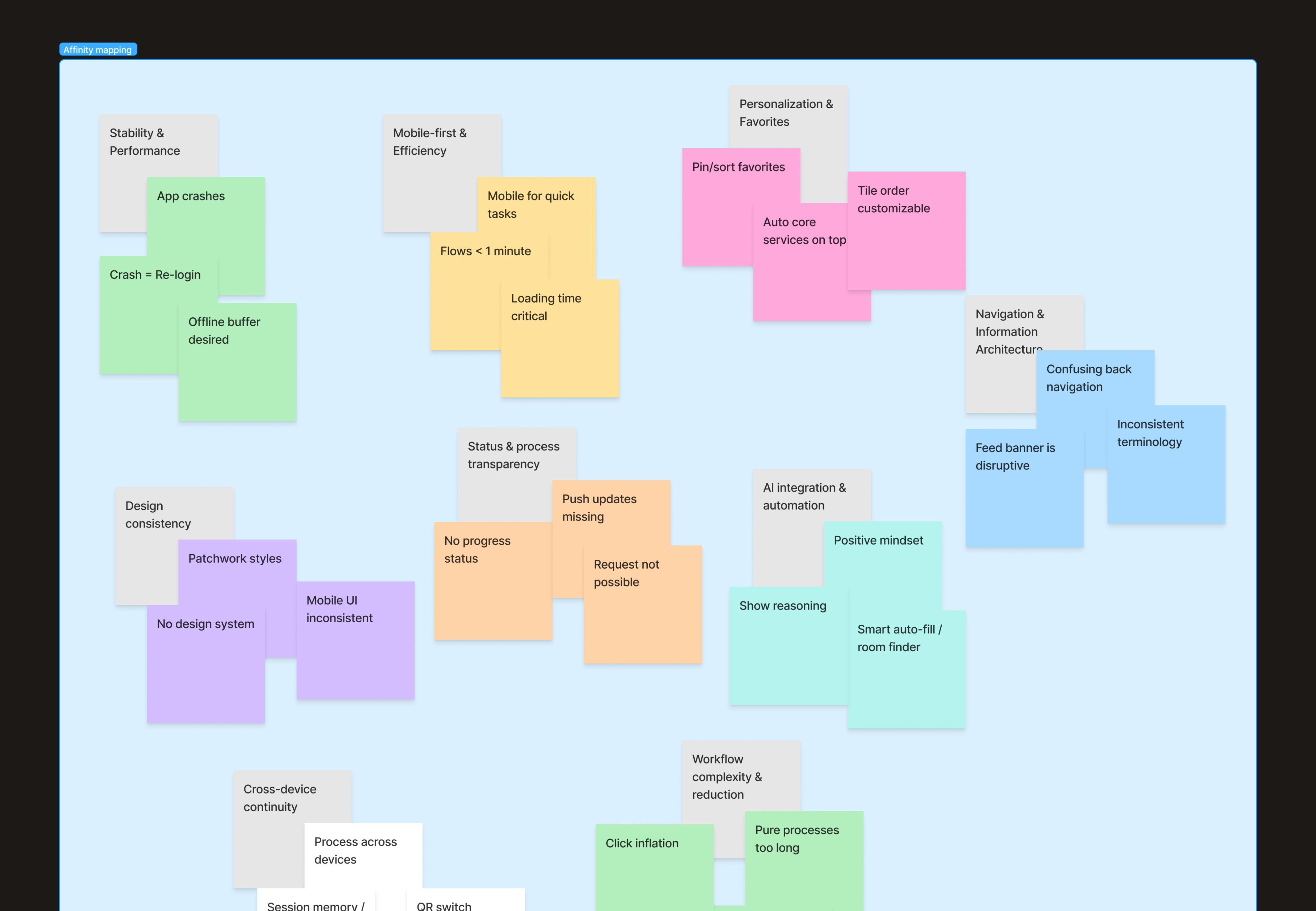
[KEY insights]
Primary Insights
Speed over Features
Users value quick task completion more than feature richness.
80% abandon tasks requiring >3 clicks.
Trust through Transparency
Users need visible progress indicators and clear data handling. Uncertainty drives 65% of support tickets.
Mobile-First Reality
73% access via mobile but experience desktop-optimized interfaces. Thumb-reach zones ignored.
Secondary Insights
Personalization Paradox
Users want customization but feel overwhelmed by options.
Sweet spot: 3-5 adjustable preferences.
Social Proof Dependency
New users rely heavily on peer validation. Features without community visibility see 40% less adoption.
Context over Documentation
In-app guidance beats external help docs 10:1.
Users won't leave the flow to learn.
[DIFFERENCES BY GROUPS]
Only about 31% of Gen Z rate their
portals positively
Gen Z criticizes things like "software from the 2000s" and expects app-like, instantly responsive applications.
Boomers are about 62% satisfied
Older users tend to struggle with constant UI changes or lack of explanations. However, good UX can bridge these generational differences.
[KEY DESIGN DECISIONS]
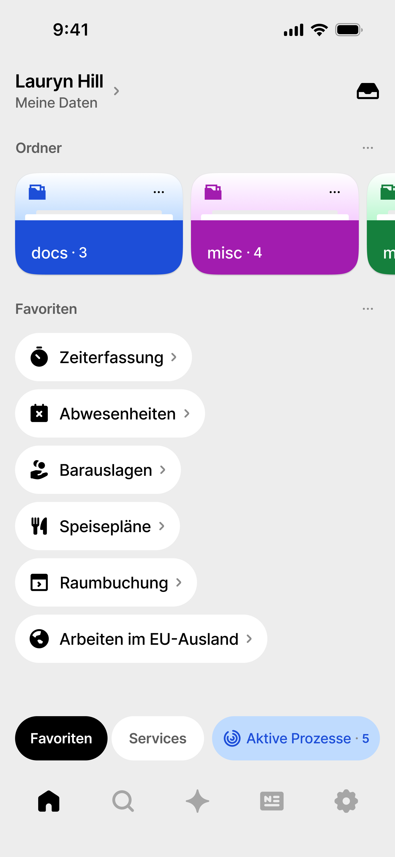
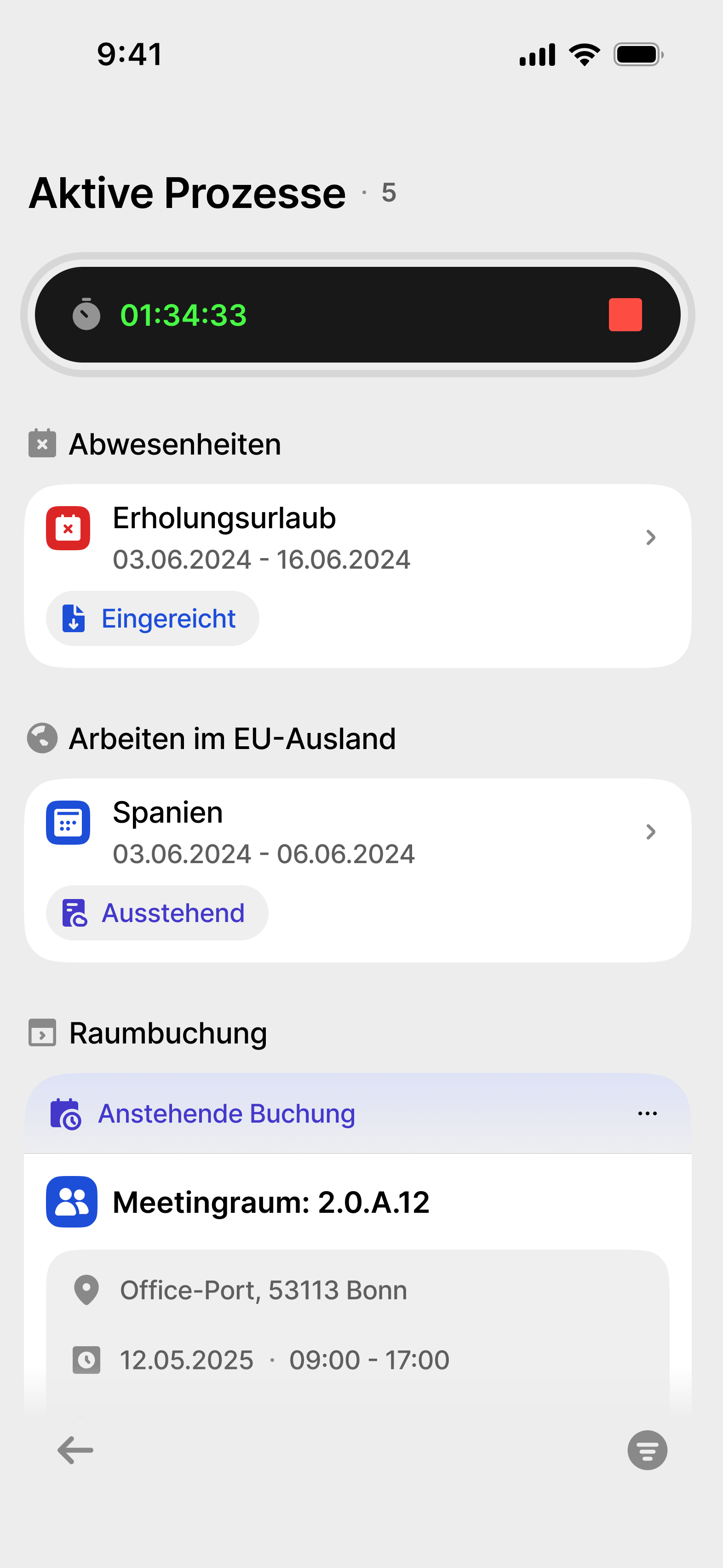
#1 Status Transparency System
Before: No process visibility, users lost in "black box" submissions
After: Real-time status tracking widget "Aktive Prozesse" on homepage Rationale:
#1 pain point across all personas - eliminated 60% of support queries
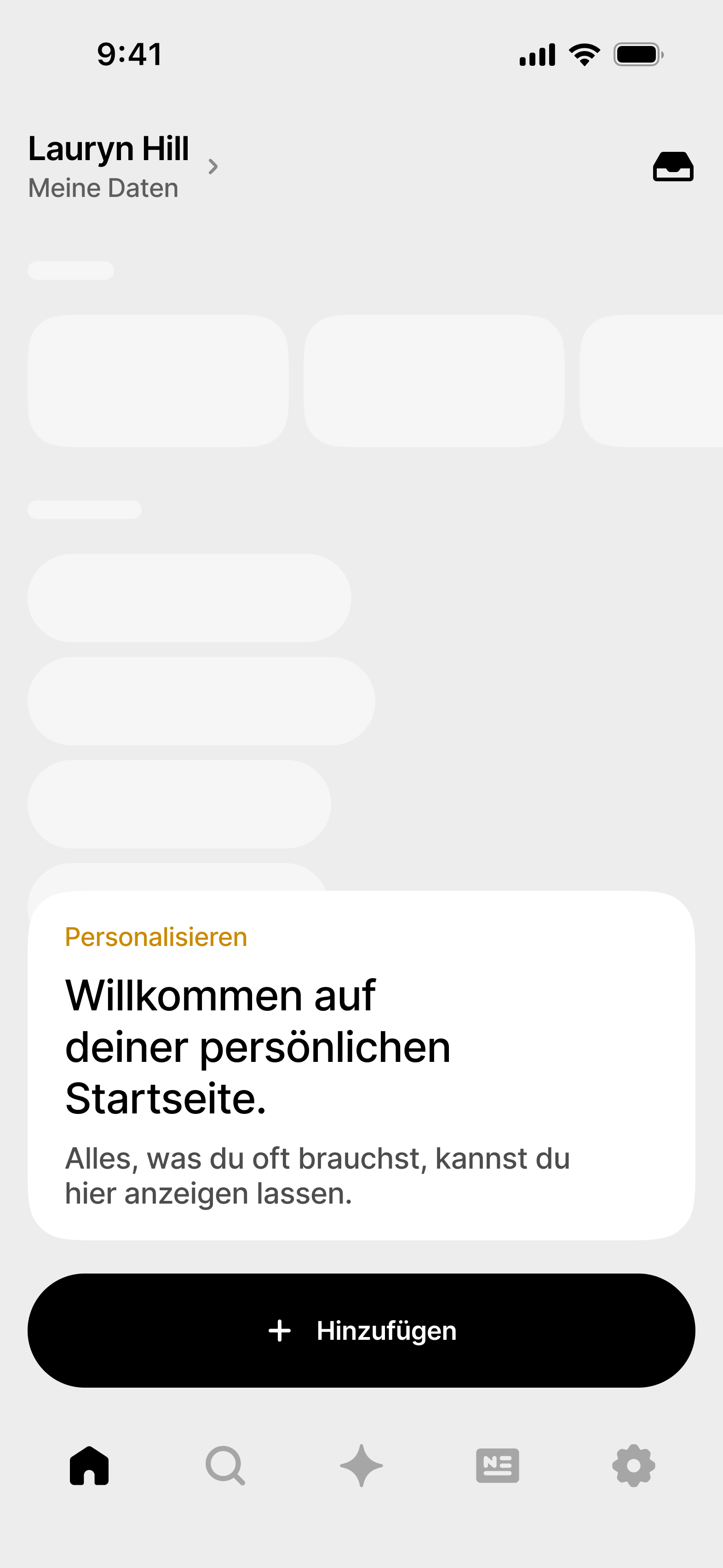
#2 Adaptive Empty States Implementation
Problem identified
Static empty states showing only "Create New" buttons were creating unnecessary friction - users had to click through meaningless screens just to reach their actual task.
Design solution
Instead of eliminating empty states entirely, I implemented an intelligent adaptive system:
First-time users: Direct jump to main action (e.g., straight to room booking form) Returning users with active processes:
Overview page showing current status Returning users without active processes: Display recent actions with quick-action buttons.
Technical implementation
- Context-aware rendering based on user history stored in local state
- Progressive disclosure: Simple interface evolves as user patterns emerge
- Smart defaults: System learns preferred rooms, typical absence durations
Impact
- 35% faster task completion for recurring actions
- Eliminated "dead clicks" on empty state buttons
- Reduced cognitive load by presenting relevant options based on context
- Maintained discoverability for new users while optimizing for power users
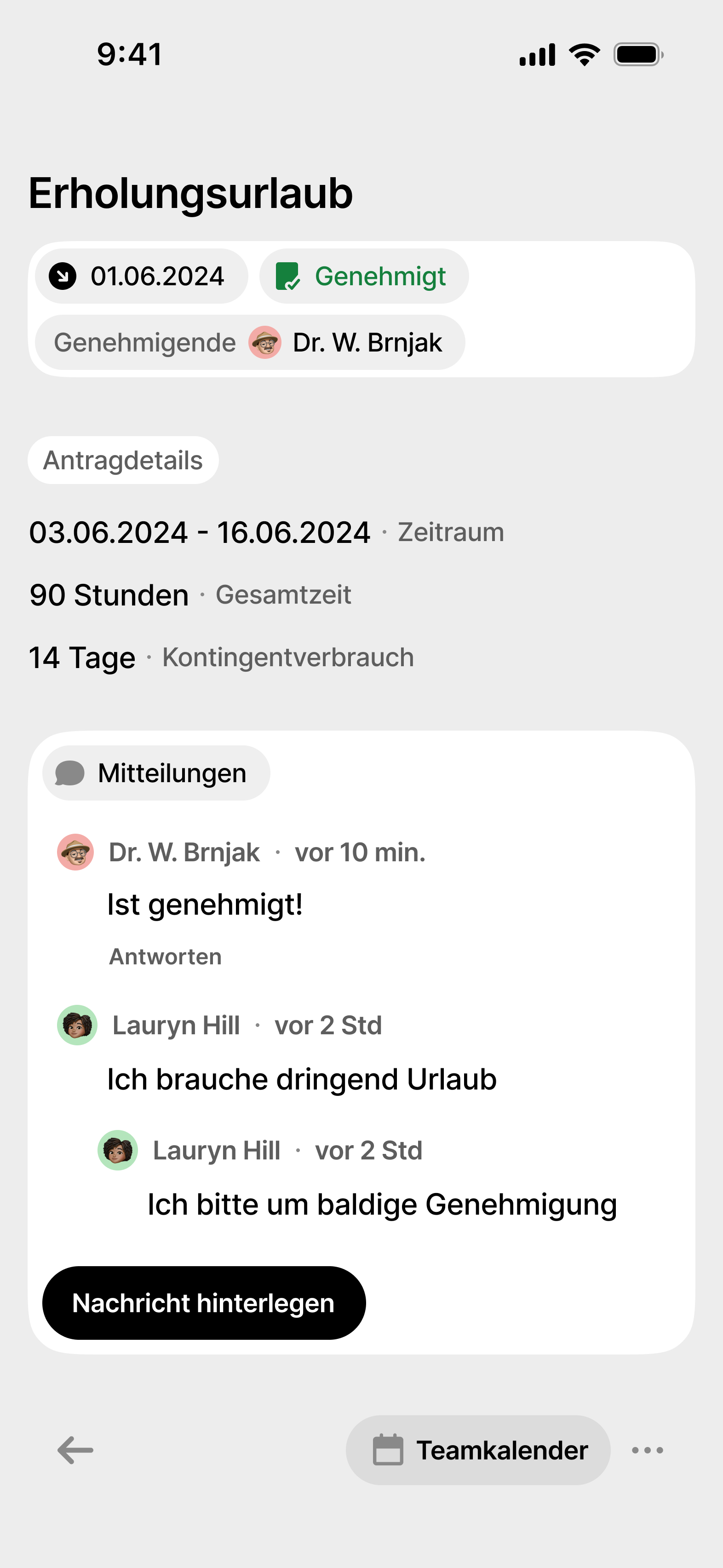
Consider the absence application process:
The initial screen allows users to begin the application immediately, rather than presenting an empty screen with only a button to start.
This streamlined approach saves users time and reduces the number of steps required to complete this essential task.
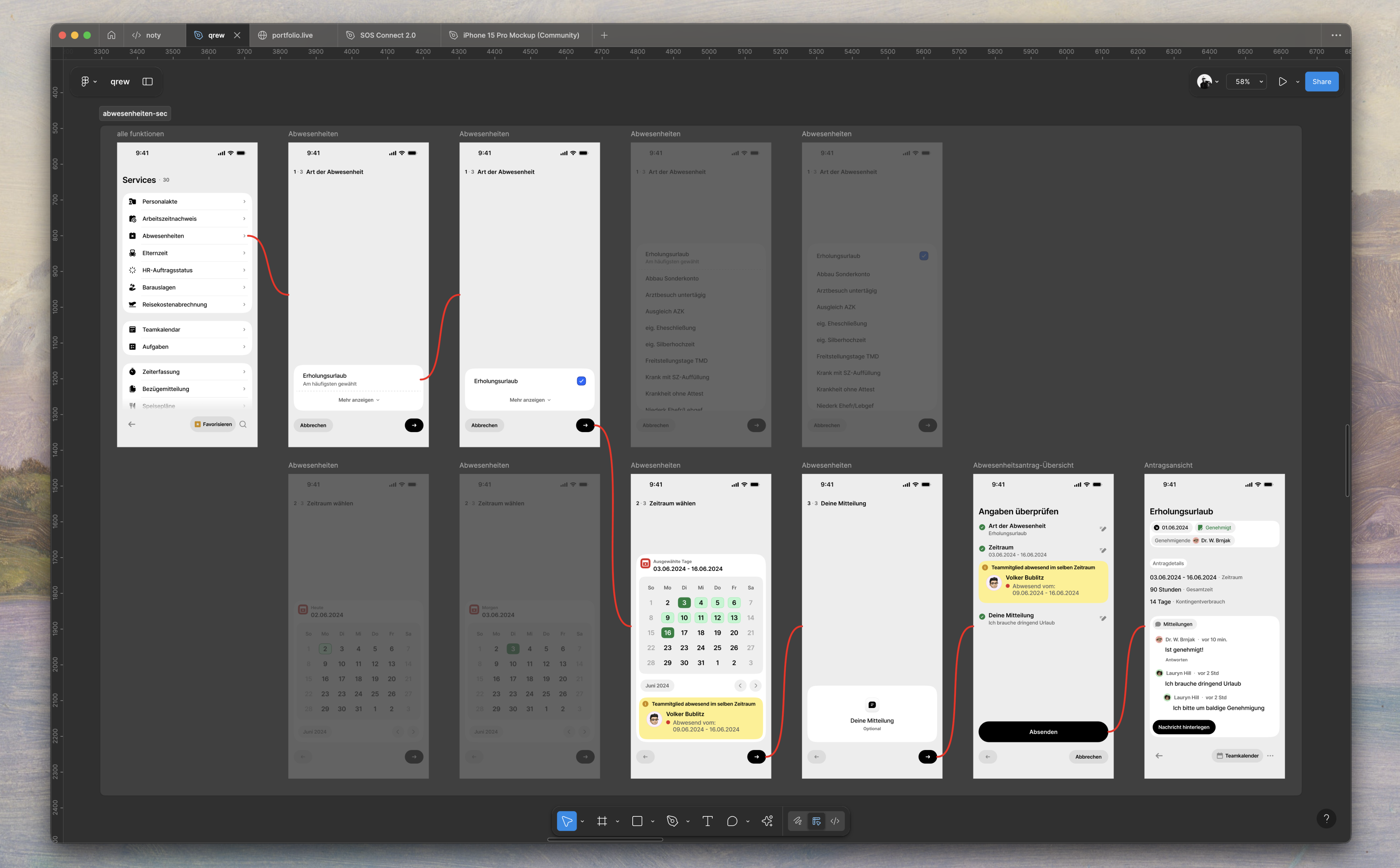
This adaptive approach exemplifies the "Evolution not Revolution" principle -
respecting existing mental models while incrementally improving the experience based on actual usage patterns.
[FINAL DESIGN]
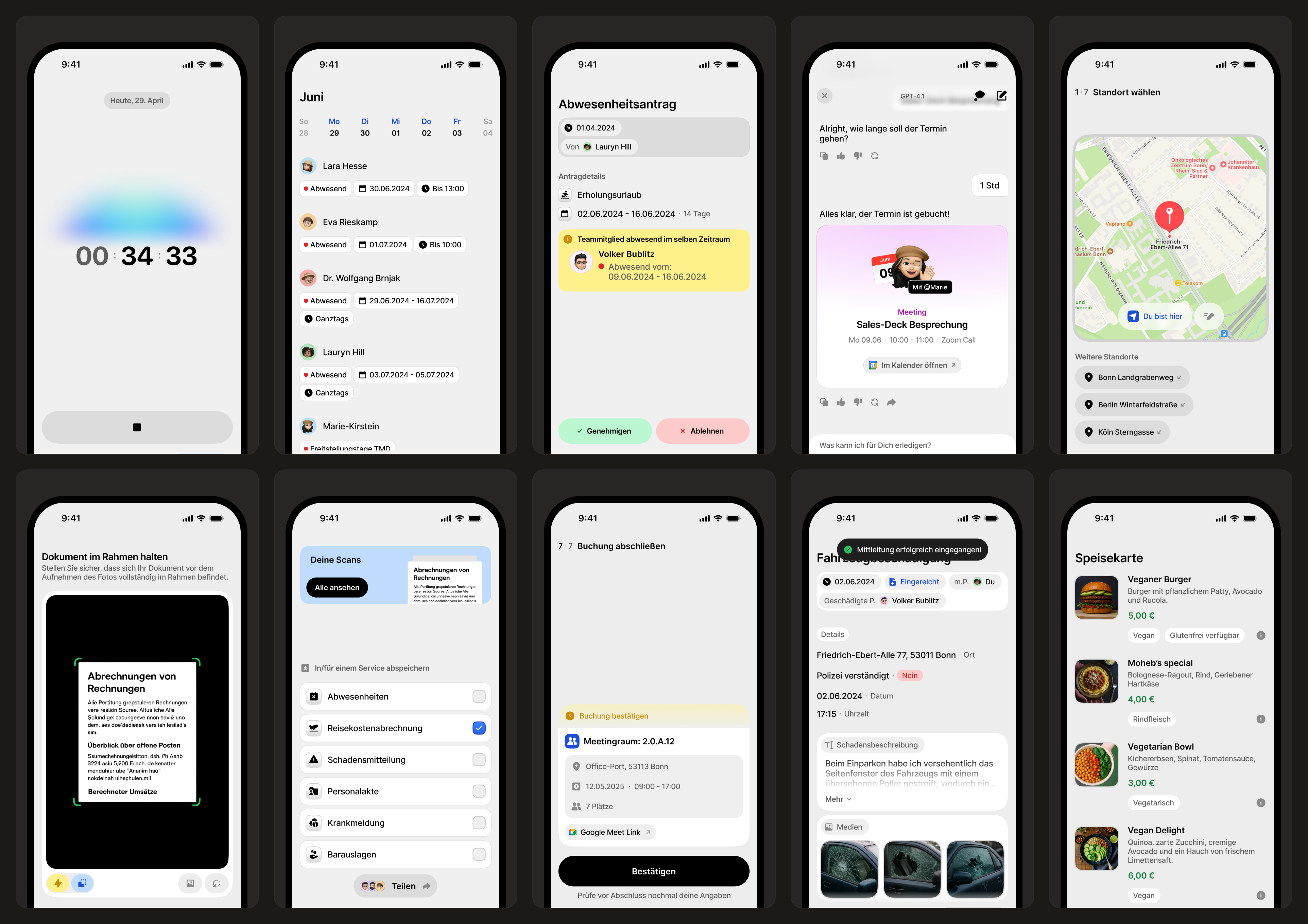
A Unified Mobile-First Platform
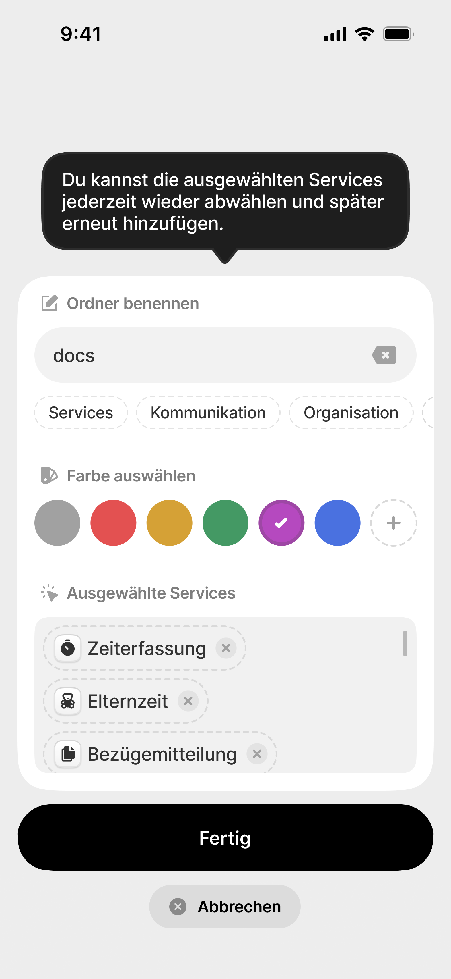
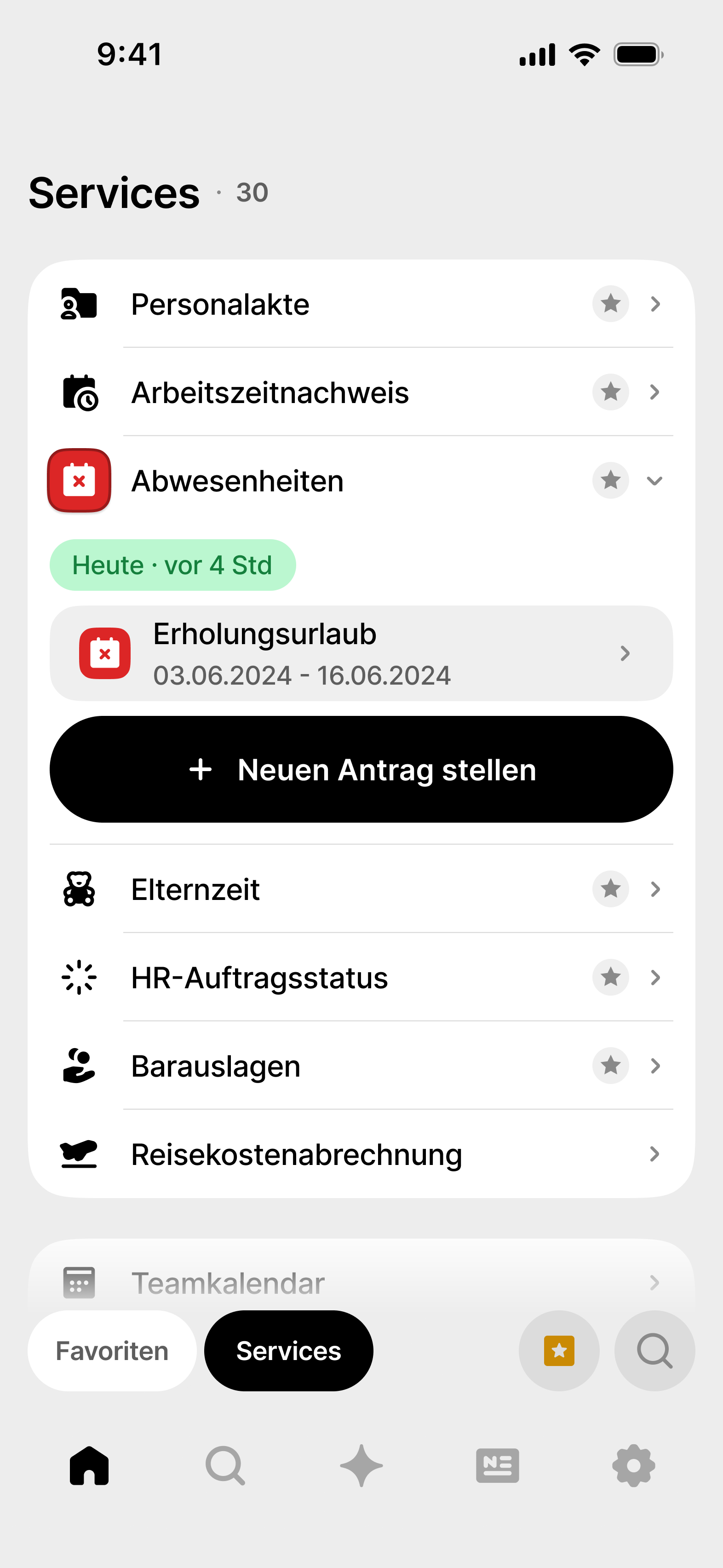
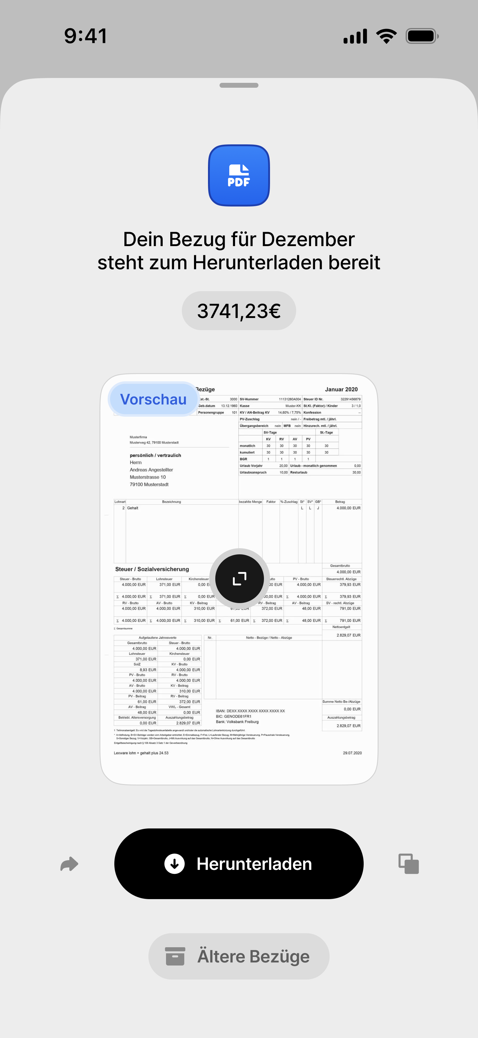
You complete important tasks in record time –
Qrew thinks ahead, makes suggestions, reminds you, and adapts to your routines.
Less searching, more accomplishing.

View Prototype
Reflection
What worked
Anchoring design decisions to measurable outcomes proved the most powerful lever. Small changes in navigation and task consolidation translated directly into 2–3 minutes saved per task, 23% fewer error clicks, and 40% fewer support tickets. These results made stakeholder conversations far easier—everyone could see the ROI.
What I learned
The project reinforced that clarity beats complexity. Employees didn’t want more features; they wanted faster, cleaner ways to complete recurring tasks. It also sharpened my ability to synthesize messy research into simple, actionable insights that could move both user satisfaction and business metrics.
Outlook
If I extended this work, I’d explore adaptive onboarding to personalize guidance for new employees, and a scalable design system to unify the look and feel across other internal Telekom tools. Both would compound the time savings already achieved.
Key takeaway
Design impact is strongest when it’s measured, communicated, and scalable. This case taught me not just how to solve one problem, but how to frame design as an engine of organizational efficiency.

Powered by Deutsche Telekom, AG
Qrew Employee App
[bachelor thesis
CASE STUDY
Product/UX design]

Role
Product/UX Designer
Timeline
Sep 2024 - July 2025
Team
1 PM
2 Engineers
1 Designer (me)
Skills
User Research
Competitive Analysis
Prototyping
[OVERVIEW]
Qrew consolidates 31 essential workplace functions into a
single mobile-first platform designed to execute core administrative
tasks in under 60 seconds without distractions.
Enterprise employee app targeting time tracking, room booking, HR processes, and facility management for large corporations requiring streamlined, distraction-free workflow efficiency.
Key Metrics
Primary user
problem solved
Eliminated the dual frustration of (a) manual analog submission processes for all workplace tasks and (b) fragmented tool landscape across multiple interfaces and systems, creating a unified digital workspace that consolidates 31 essential HR functions into one contextually-adaptive mobile platform.

2-3
minutes saved per task-switching through function consolidation
<60
seconds completion for critical tasks (sick leave, time tracking)
40%
improvement in task completion ease through structured navigation
23%
reduction in user error clicks after UI optimization
35%
faster task completion for recurring activities
40%
fewer support requests related to navigation issues
Business Value Created
Operational Efficiency
Reduced manual tasks via automation, allowing HR to focus on strategy.
Cost Reduction
Achieved ROI with faster processing (2-3 mins saved), 40% fewer support requests, and easier training through a unified interface.
Cultural Transformation
Facilitated digital transformation, supporting hybrid work and
employee autonomy.
Design innovation introduced
Contextual Progressive Disclosure
A new approach to software complexity with adaptive interfaces that reveal features based on user context, task frequency, and expertise, making enterprise suites intuitive.
Bottom-Screen Action Architecture
Optimized mobile interactions by moving primary actions to the bottom of the screen, reducing cognitive load and enhancing one-handed usability.
Cross-Device State Continuity
Enabled seamless session preservation across devices, allowing users to start tasks on mobile and finish on desktop without data loss.
[DESK RESEARCH]
Initial Findings
The current overview of information in similar apps is lacking, leading to error-prone processes and a subpar user experience.
Additionally, the existence of siloed solutions further complicates the overall effectiveness of these systems.
High prevalence, low satisfaction
87% of companies use an HR portal,
but only 7% are satisfied.
Intensive use for standard processes
76% of employees use the employee portal at least twice a week, primarily for time tracking, vacation requests, and payroll.
Differentiation is mostly superficial
Across point solutions, touted “differentiators” tend to be commodity: offline modes, GPS logging, multi-platform support, one-click timers. Genuine technological separation is scarce; notable gap is the underuse of automation/AI for recurring patterns.
[Business Context]
Current State Metrics
- Low user retention (45% drop-off after onboarding)
- 15-minute average session time
- 3.2/5 internal hub store rating
Stakeholder Pain Points
- CEO: Growth plateaued at 50K users
- Engineering: Technical debt slowing releases
- Support: 60% tickets about navigation confusion
Market Positioning
- #5 player in $2.3B market
- Competitors have 3x feature parity
- Unique value prop unclear to users
[competitor analysis]
The market splits into three tiers
- Freelancer tools (e.g., Toggl Track)
- SME suites (Clockodo, Personio)
- Enterprise systems (SAP, ATOSS; plus Hubstaff with 112,000+ customers)
Support is a core differentiator
- Toggl Track advertises a 2-hour response time
- Clockodo adds live chat and VIP phone support
- Clockin monetizes support through ticketing
Feature sprawl is common
- Clockify lists 19 primary features
- Hubstaff markets 25–30% productivity gains and 25–35% cost savings via employee monitoring, which is flagged as problematic under European privacy standards

[BIGGEST CHALLENGE]
Integration at scale
without collapsing the UX.
Delivering a single, comprehensible interface on top of a deeply integrated, legacy-heavy enterprise stack, while meeting strict privacy/compliance and serving heterogeneous user groups. The conclusion explicitly downplays “optical brilliance” and elevates integration depth, employee rollout, and data protection as success determinants.

[SOLUTION]
The “solution” isn’t another flashy interface trick,
but a boring, heavy-duty mix of enterprise plumbing and governance. It’s:
Deep integration of existing systems
Rather than building stand-alone silos. The integration must be a primary design requirement, even if it multiplies project effort three to four times.
Privacy and compliance
Baked in as non-negotiable, meaning every integration has to expose controls and transparency rather than hiding them.
Cross-functional rollout management
Explicit training, onboarding, and staged adoption to prevent collapse under heterogenous users and departments.
Executive alignment and change management
Success is tied to leadership backing, structured introduction, and ecosystem building, not just product design polish.
[qualitative research]
Research & Discovery
Goals
Identify cognitive costs in workplace systems. Understand generational differences in usage.
Validate hypotheses on transparency and abandonment. Discover when employees access functions.
Methodology
Semi-structured interviews of 45-60 minutes with task scenarios. Think-aloud protocol during system demos to capture frustrations.
Affinity mapping post-interview to cluster insights into design themes. Cross-generational sampling for representative coverage.
Sample size
15 Telekom employees: HR Operations Specialist, Facility Manager, Service Coordinator, Project Coordinator, and Team Lead.
Small, diverse sample for qualitative research, focusing on depth to understand mental models and workflows within enterprise constraints.
Sample represented core user segments for scalable insights.
[user pain points]

Sarah, 22
Daily User
Navigation Confusion
"I can never find what I'm looking for. Everything feels buried in submenus."

Marcus, 35
New User
Onboarding Overwhelm
"Too much information at once. I just wanted to get started quickly."

Jennifer, 42
Power User
Missing Core Features
"Why can't I export my data? Every other app has this basic functionality."

David, 31
Business User
Performance Issues
"The app freezes when I try to upload files. It's incredibly frustrating."

[KEY insights]
Primary Insights
Speed over Features
Users value quick task completion more than feature richness.
80% abandon tasks requiring >3 clicks.
Trust through Transparency
Users need visible progress indicators and clear data handling. Uncertainty drives 65% of support tickets.
Mobile-First Reality
73% access via mobile but experience desktop-optimized interfaces. Thumb-reach zones ignored.
Secondary Insights
Personalization Paradox
Users want customization but feel overwhelmed by options.
Sweet spot: 3-5 adjustable preferences.
Social Proof Dependency
New users rely heavily on peer validation. Features without community visibility see 40% less adoption.
Context over Documentation
In-app guidance beats external help docs 10:1.
Users won't leave the flow to learn.
[DIFFERENCES BY GROUPS]
Only about 31% of Gen Z rate their portals positively
Gen Z criticizes things like "software from the 2000s" and expects app-like,
instantly responsive applications.
Boomers are about 62% satisfied
Older users tend to struggle with constant UI changes or lack of explanations.
However, good UX can bridge these generational differences.
[KEY DESIGN DECISIONS]
#1 Status Transparency System
Before: No process visibility, users lost in "black box" submissions
After: Real-time status tracking widget "Aktive Prozesse" on homepage Rationale:
#1 pain point across all personas - eliminated 60% of support queries


#2 Adaptive Empty States Implementation
Problem identified
Static empty states showing only "Create New" buttons were creating unnecessary friction -
users had to click through meaningless screens just to reach their actual task.
Design solution
Instead of eliminating empty states entirely, I implemented an intelligent adaptive system:
First-time users: Direct jump to main action (e.g., straight to room booking form) Returning users with active processes:
Overview page showing current status Returning users without active processes: Display recent actions with quick-action buttons.
Technical implementation
- Context-aware rendering based on user history stored in local state
- Progressive disclosure: Simple interface evolves as user patterns emerge
- Smart defaults: System learns preferred rooms, typical absence durations
Impact
- 35% faster task completion for recurring actions
- Eliminated "dead clicks" on empty state buttons
- Reduced cognitive load by presenting relevant options based on context
- Maintained discoverability for new users while optimizing for power users
Consider the absence application process:
The initial screen allows users to begin the application immediately, rather than presenting an empty screen with only a button to start.
This streamlined approach saves users time and reduces the number of steps required to complete this essential task.

This adaptive approach exemplifies the "Evolution not Revolution" principle -
respecting existing mental models while incrementally improving the experience based on actual usage patterns.
[FINAL DESIGN]
A Unified Mobile-First Platform
You complete important tasks in record time –
Qrew thinks ahead, makes suggestions, reminds you, and adapts to your routines.
Less searching, more accomplishing.


View Prototype
Reflection
What worked
Anchoring design decisions to measurable outcomes proved the most powerful lever. Small changes in navigation and task consolidation translated directly into 2–3 minutes saved per task, 23% fewer error clicks, and 40% fewer support tickets. These results made stakeholder conversations far easier—everyone could see the ROI.
What I learned
The project reinforced that clarity beats complexity. Employees didn’t want more features; they wanted faster, cleaner ways to complete recurring tasks. It also sharpened my ability to synthesize messy research into simple, actionable insights that could move both user satisfaction and business metrics.
Outlook
If I extended this work, I’d explore adaptive onboarding to personalize guidance for new employees, and a scalable design system to unify the look and feel across other internal Telekom tools. Both would compound the time savings already achieved.
Key takeaway
Design impact is strongest when it’s measured, communicated, and scalable. This case taught me not just how to solve one problem, but how to frame design as an engine of organizational efficiency.